Translating a bold brand identity to digital
Translating a bold brand identity to digital
Translating a bold brand identity to digital
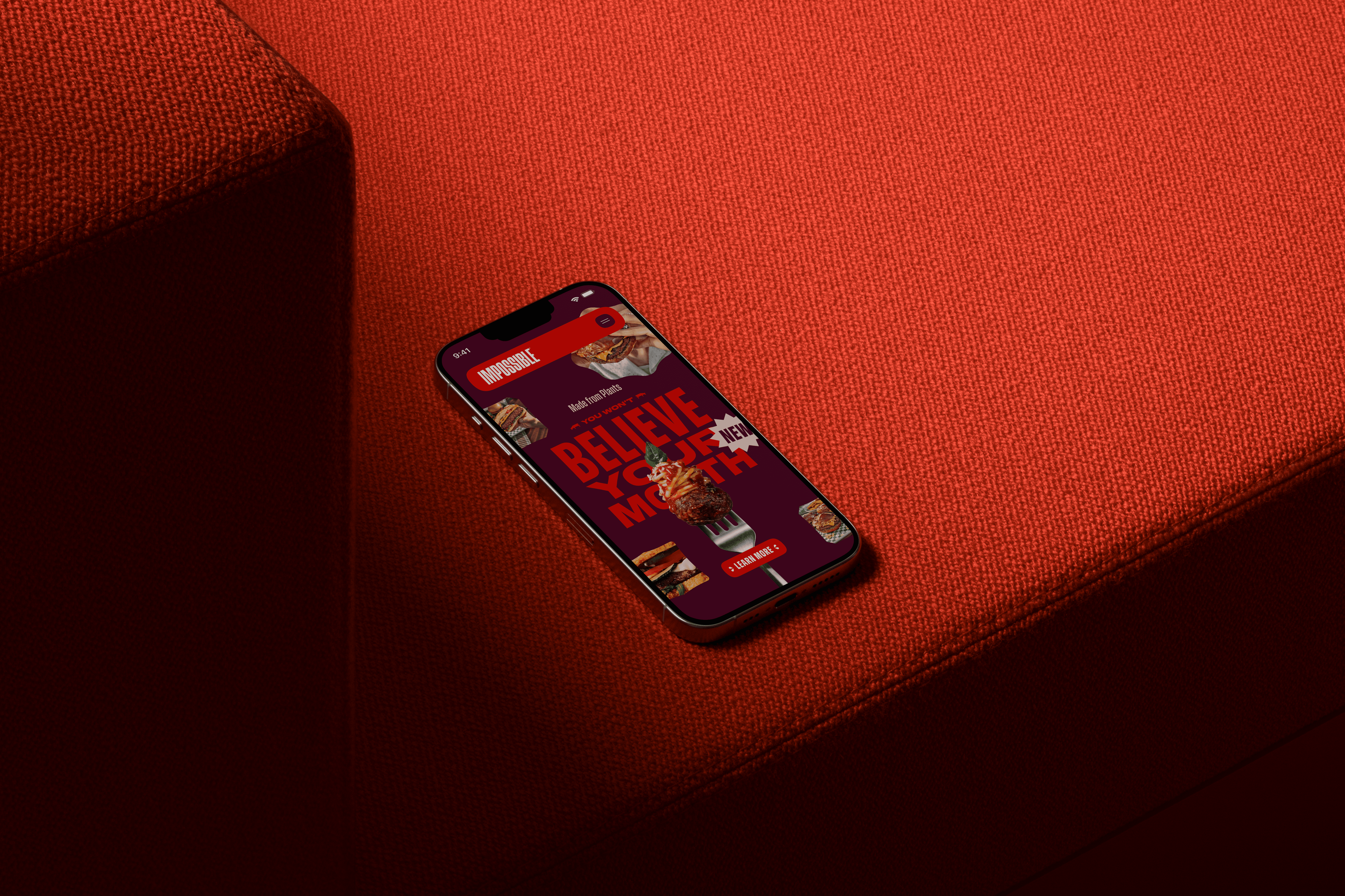
Impossible Foods’ new visual identity is loud, graphic and highly expressive. Strong typography, saturated colors and large food photography are used to communicate the richness of the products.
Translating this style to digital required careful balance. While the brand language is bold, the interface still needed to feel structured and easy to navigate.
Working closely with brand and development teams, we explored layouts that allowed the identity to remain visually striking without overwhelming the content.
Food brands rely heavily on visual appeal. The interface needed to showcase products in a way that felt rich, appetising and engaging.
Large photography, bold typography and layered compositions were used to create depth and bring attention to the products.
At the same time, content structure and visual hierarchy were carefully designed so the interface could support both storytelling and product information.
Building a flexible design system
Building a flexible design system
Building a flexible design system
To support marketing campaigns, product launches and editorial content, the website required a flexible system that could adapt to different types of pages.
I designed a modular component library that allowed teams to build expressive layouts while maintaining consistency across the site.
Reusable components helped balance creative freedom with structure, making the platform easier to scale and maintain over time.
Balancing visual expression and accessibility
Balancing visual expression and accessibility
Balancing visual expression and accessibility
The brand palette pushes contrast and color combinations to their limits.
A key part of the work was making sure the interface remained accessible and readable.
Color combinations, typographic hierarchy and component behaviour were carefully defined to meet accessibility standards while preserving the brand’s strong visual identity.
A system that supports storytelling
A system that supports storytelling
A system that supports storytelling
The final result was a digital platform that allows the brand to tell product stories in a clear and engaging way. The modular system makes it easier to introduce new products, recipes and campaigns while maintaining a consistent experience across the site.
The final result was a digital platform that allows the brand to tell product stories in a clear and engaging way. The modular system makes it easier to introduce new products, recipes and campaigns while maintaining a consistent experience across the site.
This project showed how a strong brand identity can be translated into a flexible digital platform.
By building a modular system around the visual language, the team was able to support storytelling, campaigns and product launches without losing visual consistency.
This project showed how a strong brand identity can be translated into a flexible digital platform.
By building a modular system around the visual language, the team was able to support storytelling, campaigns and product launches without losing visual consistency.